Many thanks to Evgeny Rugalev for helping me put together this list 😉
While some of the trends remain from last year, let’s see what is gaining popularity/traction as this year comes to a close and the year 2020 emerges on the horizon.
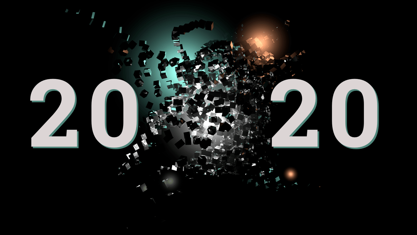
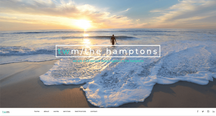
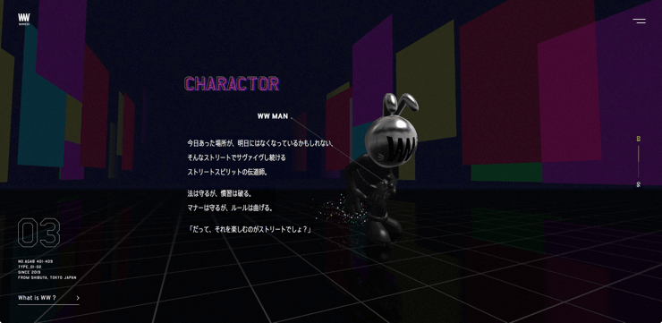
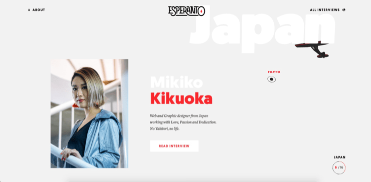
1. Monochrome websites
We’re seeing more monochrome homepages towards the end of the year. Some web designers seem to prefer clean-looking light mode, while others place their bets on the classy, impactful dark. Lighter websites appear to be outnumbered by darker ones, hence the title of this article.
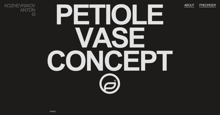
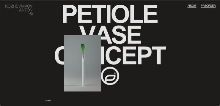
2. Distraction-free first screen
Never before have we seen so many websites that put a bare minimum of words and elements on the first screen (the area one sees “above the fold,” that is, before they scroll down to learn more about the website).
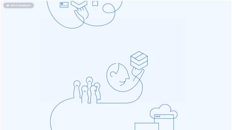
3. Hand-crafted feel
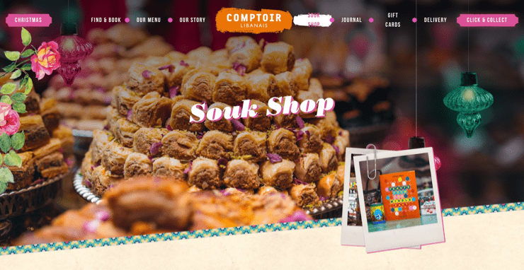
Heavy use of illustration continues, but with a twist. The latest trend is to superimpose hand-drawn-looking doodles on top of images. In general, many visuals bear a custom-made, hand-crafted feel.
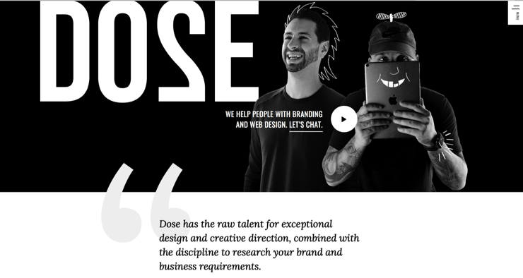
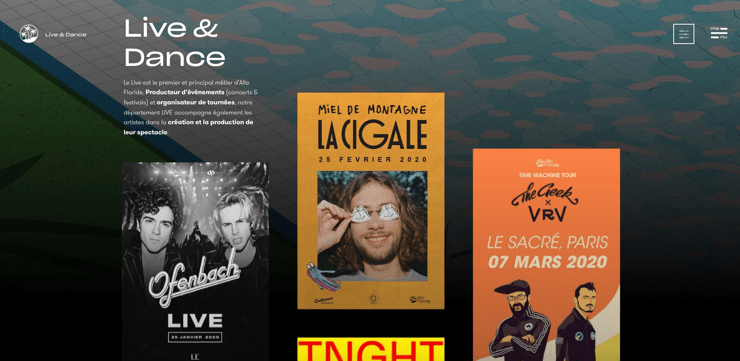
4. Gifs and animation
If we look at how animation is being used, last year, it was mostly abstract shapes and geometry. This year, things get real with photo gifs and animated illustrations of real-world things.
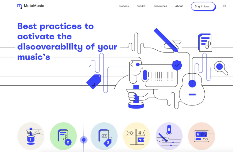
5. Line art: static and animated
The term “line art” refers to simplified illustrations created by using lines only and leaving the shapes empty. It became a distinct trend in 2018 and has been gaining traction ever since.
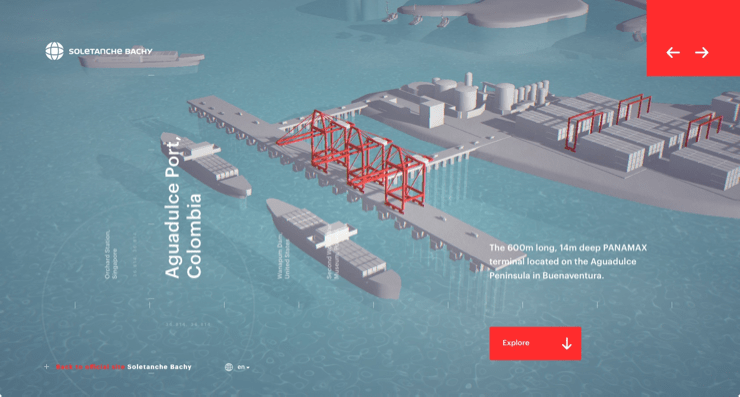
6. Experience design
Even more websites now offer immersive, video game-like experiences. This means heavier use of 3D and animated graphics design.
7. Negative space
So-called “negative space” is nothing new. However, as the pursuit of noiseless, minimalist websites continues, we’re seeing ever more web pages where scarce bits of information are surrounded by vast volumes of distraction-free background.
The trend could be driven by the fact that the world’s average attention span is shrinking, as the media and advertisers try to cramp an ever increasing amount of information into people’s minds. Negative space drives one’s focus to things that are truly important.
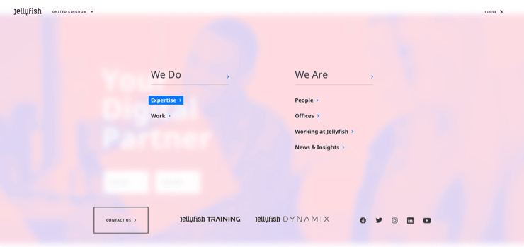
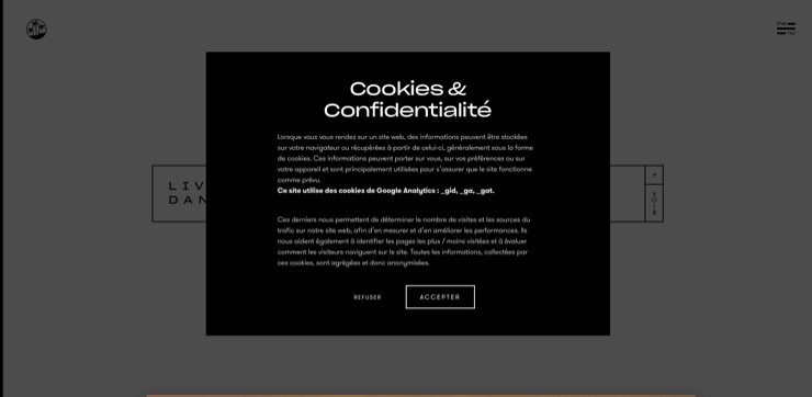
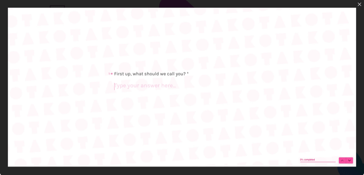
8. Page-wide UI elements
Many websites sport page-wide menus, forms, and dialog boxes this year. The trend is not completely new, but it seems to have spread out from involving mostly menus to also including cookie popup notifications, contact forms, and other UI elements.
9. Creative navigation and microactions
Creative scroll effects and microactions are all the rage now. They also seem to be better thought-out and less glitchy than last year. Scrolling down the page can lead to anything these days – it’s bad tone to simply let the user go down the page the good old-fashioned way.
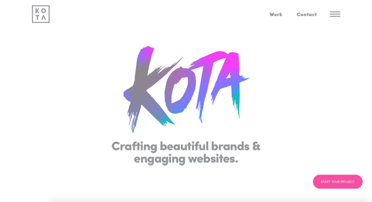
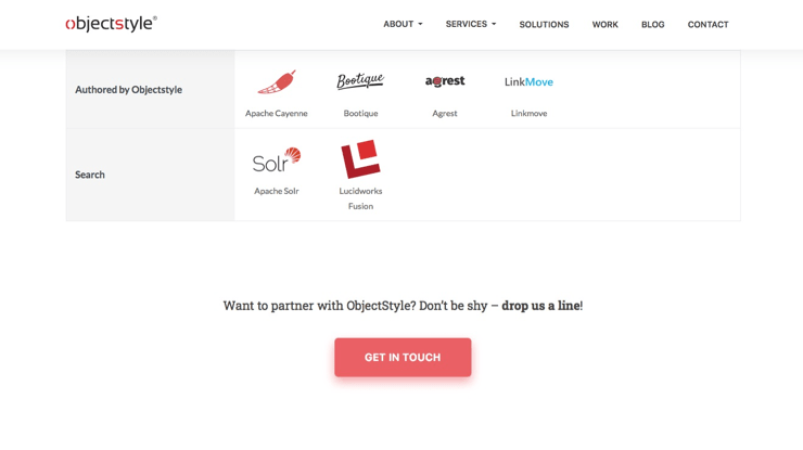
10. Vibrant gradients and colored shadows
The trend is to use gradients and colored shadows in various UI elements from sections to buttons. This appears to be a counter-trend that is supposed to add some vibrancy to otherwise “calm” pages.
Some buttons on ObjectStyle’s website now have colored shadows – see for yourself! (And do remember to get in touch if you think you’re interested in doing business with us 😉 )
TL; DR
The main web design trends for 2020 are: the use of monochrome themes, especially dark ones; mixing photos and illustrations; line art; surrounding concise bits of information with plenty of negative space; being creative with your navigation and microactions; and using color gradients and colored shadows in various UI elements.