Judging by the tendencies we are seeing towards the end of this year, the time has come for bold, animated designs that, quite literally, make your head spin. Lots of sites are making heavy use of animation, gifs, and all sorts of parallax effects. Micro-interactions are everywhere.
There is another noticeable trend – everyone wants to break the rules. Your menu can be anywhere, as well as your text and your pictures. Your images can slide, swirl, or swim – at the visitor or away from them. They can quiver, blink, or jitter – again, there are no rules here. We’ve seen websites behave in totally random ways (watch the video we’ve put together for examples.)
Now let us dive into some specifics.
Navigation
Funnel view
I’d call this type of scrolling behavior a trip “down the rabbit hole.” As you scroll down the page, you are taken through a vortex of visuals, only to stumble on yet another vortex, yet another piece of information.
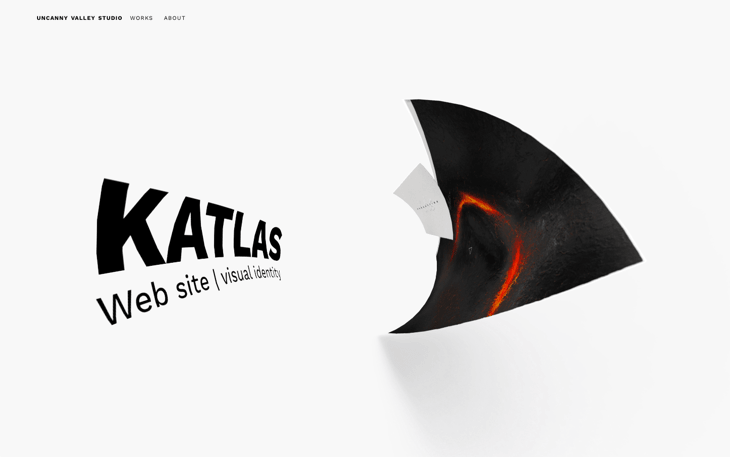
Here is an example from Uncanny Valley Studio where you can scroll to go back and forth between different swirls of information.
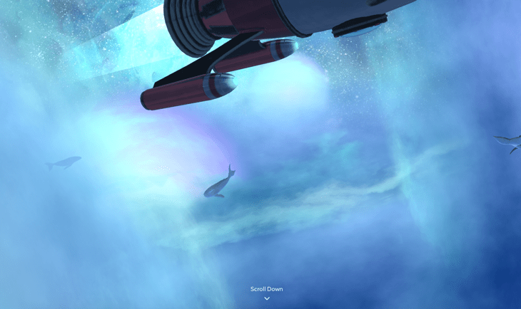
Another example is Magic Leap, where the scrolling behavior changes as you move through the page.
Spot-like cursors
This year, we’ve seen all sorts of creatively-implemented mouse cursors that change their appearance as you hover over menu items, buttons, and other interactive visuals.
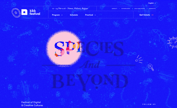
The KIKK festival page has a cursor that expands as you hover over clickable items, which gives you a festive and bubbly feeling.
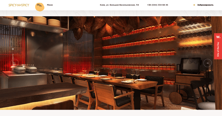
Another example is from SpicyNoSpicy, a Thai food restaurant in Kiev, Ukraine. Their spot-like cursor that echoes the website’s design behaves in a similar way – it also gets bigger as you move over clickable items.
CeliaLopez.Fr uses a stylized fine arrow pointer for a cursor. Check it out.
Vertical sliders
The good old full-page slider (the one with dot pointers at the bottom) is meant to be viewed left to right. This year, we’ve been seeing an increasing number of horizontal sliders where images simply follow one another as you scroll down.
Sage Culture features 7 full-screen slides through which you scroll horizontally (and a menu on the right that reflects your progress).
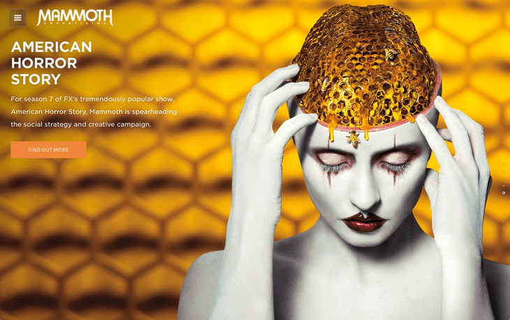
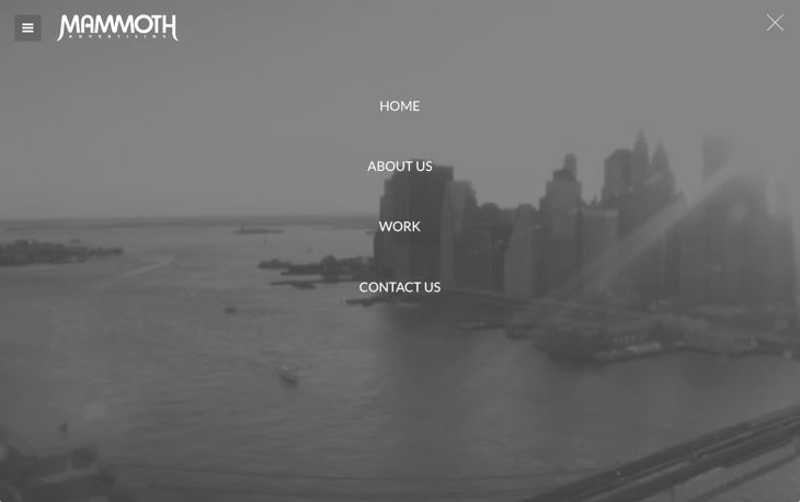
Mammoth Advertising, a New York City-based advertising agency, has a similar slider, but the dots that indicate progress are discrete and barely noticeable in their case.
Menu
Vertical menu
This year, the number of vertical menus on the Internet has been building up into a mainstream trend.
Stink Studios, a global group of creative studios, displays a traditional horizontal menu when you land on their website. But as you scroll down, the menu moves to the left. On the one hand, this keeps the menu in view; on the other hand, the menu is not covering any information at the top.
Illustrator Marrie Morelle’s website is another example, with the menu appearing on the right-hand side this time.
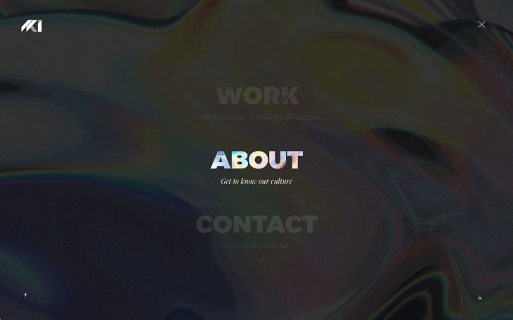
Full-screen menus
The trend we noticed last year was for desktop websites to behave like mobile ones. The tendency is now deepening, with menus getting super-imposed on the entire screen and the menu items looking just the way they would on a mobile device.
Here is an example from HKI Paris, where menu proportions are those of a mobile one.
In another example from Mammoth, we see the same mobile-style menu, essentially.
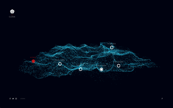
By the way, the Kin Movie website has a most unusual navigation system — their menu items seem to be nested inside some kind of space dust filament (or what is it, really?)
Visual effects
Micro-interactions
Micro-actions are tiny movements in design elements that occur when you interact with them. They make a website feel more “alive” and imbue users with a sense of greater control over the interface.
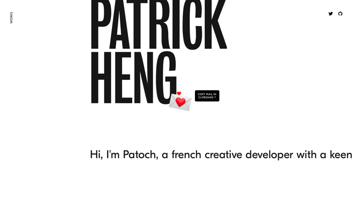
One example is Patrick Heng’s website. If you go to his About page and either hover over or click on the mail icon, a cascade of little hearts will fly in the air. And you can tell by the size of the hearts whether you’ve just hovered over it or actually copied the address.
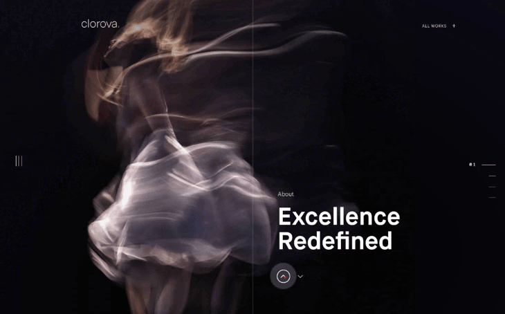
In addition to having many trendy things, such as a vertical menu and a spot-like cursor, Clorova is also full of micro-interactions that make the browsing experience more gamified.
Waves as microactions
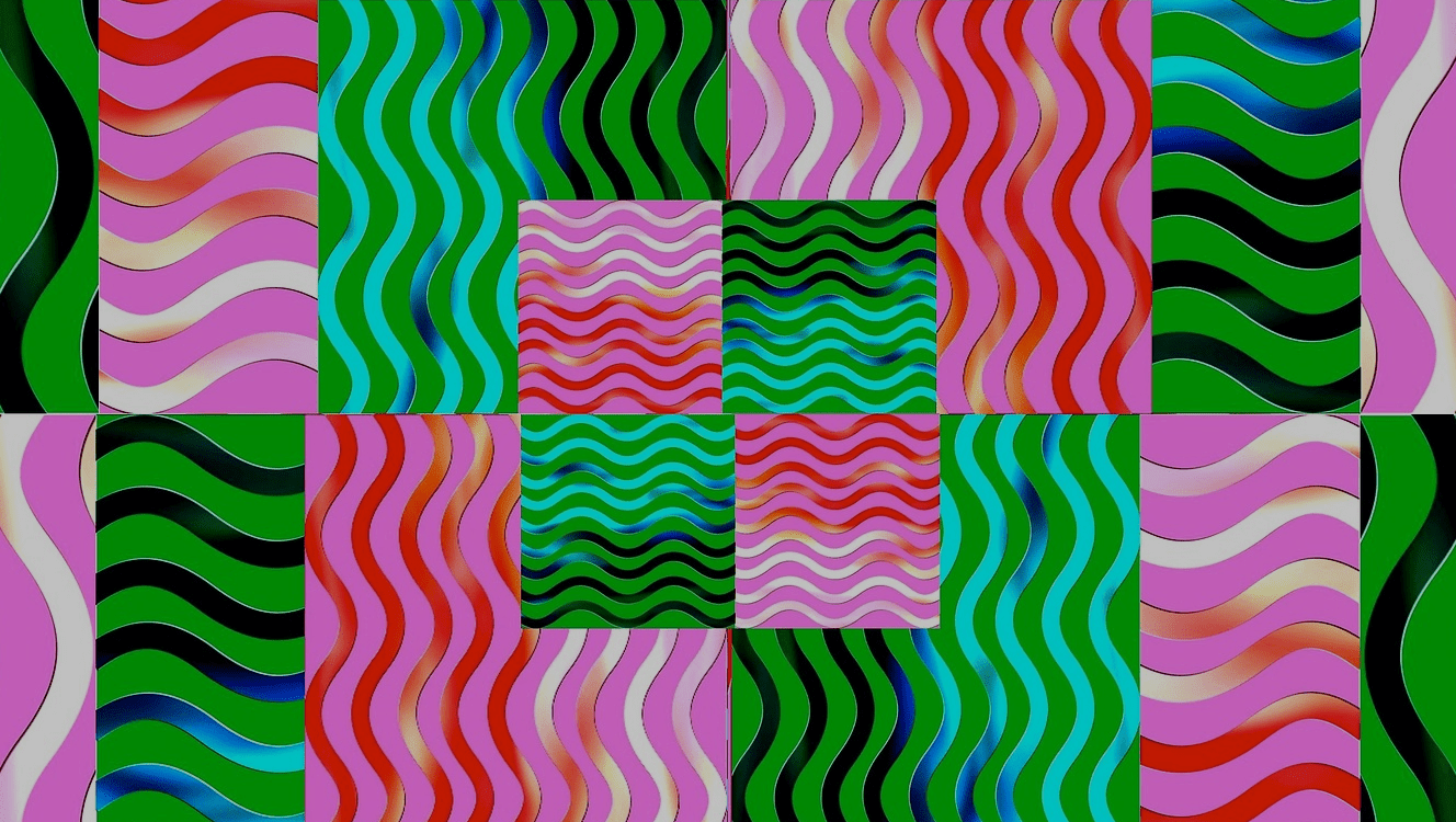
This year, we’ve seen interfaces go wavy and watery as you move the mouse over them or scroll down.
For example, as you move through the HKI Paris website, the background images get distorted as if you were touching their reflection on water.
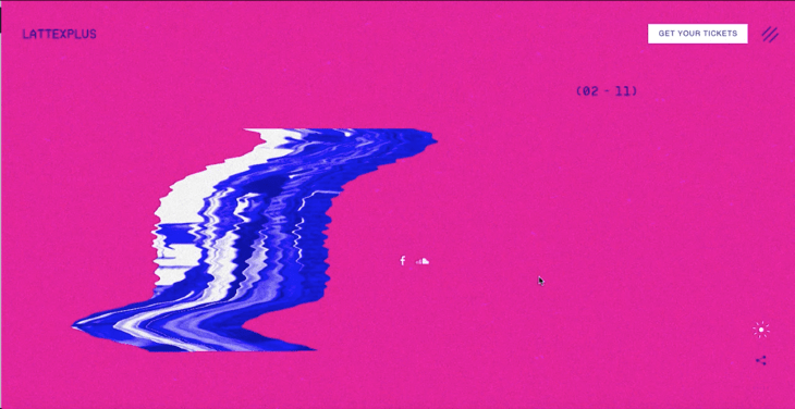
Something similar happens on the Lattexplus festival website: as you scroll down, the background gets glitchy and rippled images float in view.
Creative parallax
Parallax is still in use, it’s not going anywhere. But designers use it in new, creative ways.
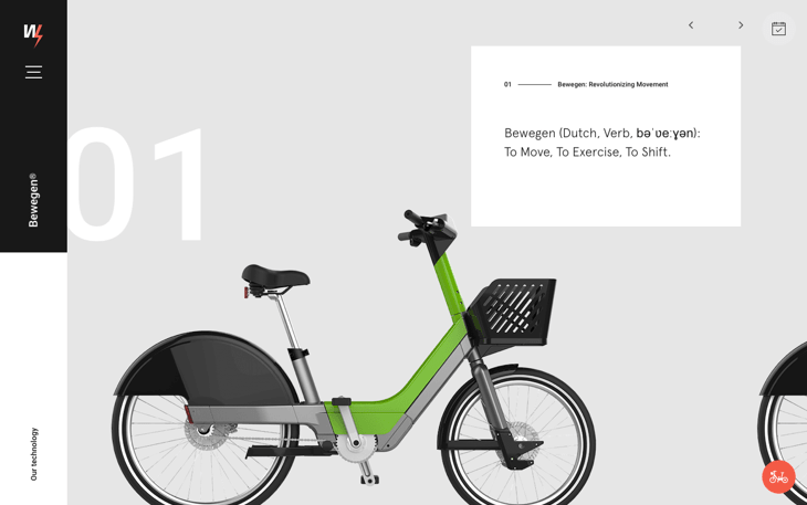
As we know, the Dutch love their bikes. A bike sharing service from Denmark, Bewegen, achieves a sense of motion through a creative use of parallax on their site.
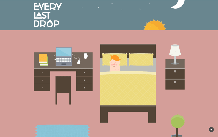
Everylastdrop.co.uk, a water usage awareness initiative from the UK, uses parallax to create a feeling of movement through time and space.
Imagery
Multiple animated elements per page
Animated elements liven up the website and attract attention. While previously a page would often have just one main animated element, these days, there could be lots of them on one page.
This project page by a French designer has quite a few gifs and moving pictures. It even shows you multiple animated images per screen at some point.
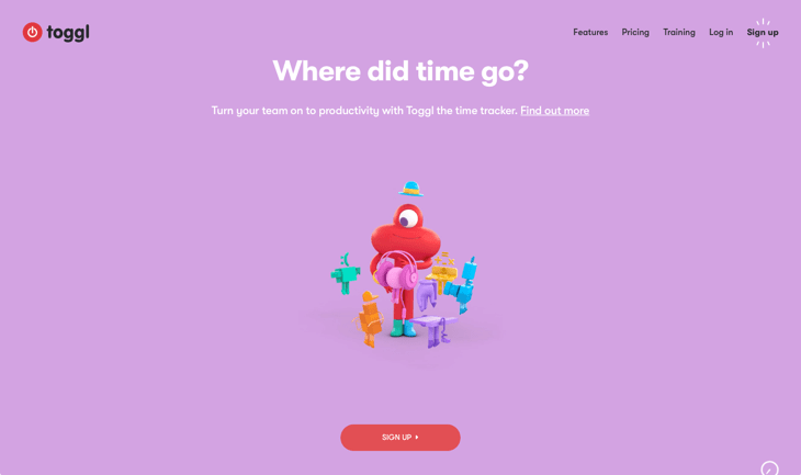
Time-tracking tool Toggle makes good use of animation by creating a unique and original piece (quite different from those here-is-our-office videos that you see on every 2.5 webpage). It’s also very up-to-the-point and completely in line with the company’s offering.
Geometric shapes
Centuries ago, hieroglyphs began as realistic depictions of real-life objects, but over time, they turned into abstract signs. (For instance, here is a symbol for “fish” in Chinese and Japanese: 魚. I don’t think you can guess that from the picture anymore.)
The process of abstracting shapes in modern design is somewhat the same. We see geometry and similar-looking shapes being used in lieu of realistic images.
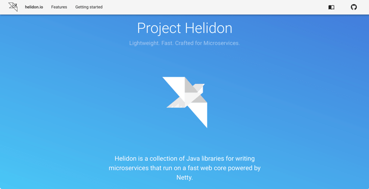
Take this example from Helidon, a Java library for microservices. The bird is made with geometric shapes.
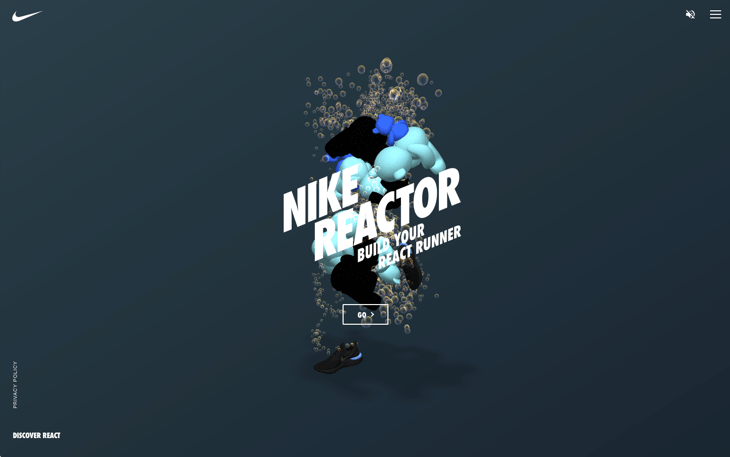
While “Nike React” may sound like a crazy combination or words to a programmer, it is, in fact, a website that lets you concoct your own sneaker designs and preview them in real time. To illustrate the idea, they use an abstract-looking figure of a runner composed of bubbles, basketballs, teddy bears, pillows, and other objects.
Custom illustrations
Since everyone is tired of stock photography, custom images continue to be heavily used — flat or animated, whichever work.
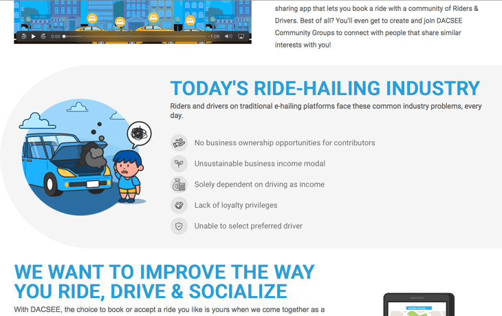
We mentioned DACSEE, a Malaysian blockchain-based taxi startup, in our post on blockchain technologies. The unique drawings on their site set a tone for their brand and help them differentiate themselves from the rest.
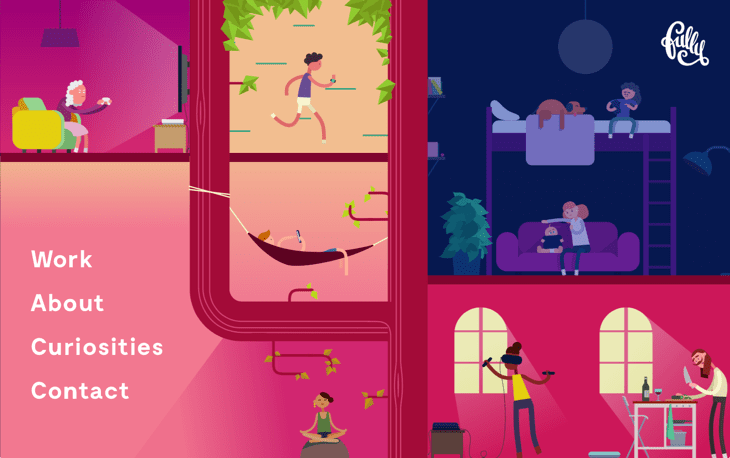
Same goes for FullyStudios, a Swedish web and film studio.
Isometric/simplified 3D illustrations
While isometric illustrations may not depict objects exactly the way they’re perceived by the human eye, they are a close approximation that lets designers create visuals faster and easier.
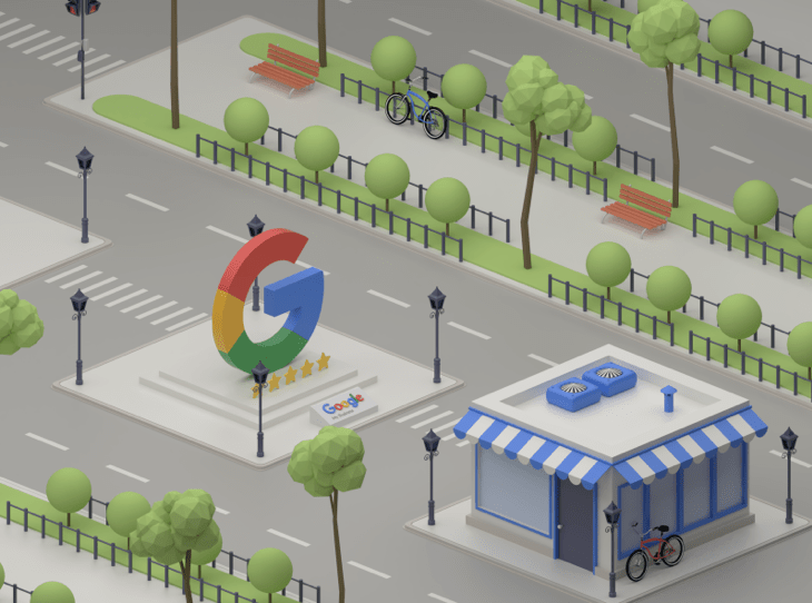
Here is an isometric illustration by Diego Velazquez — it’s his mockup for the Google My Business service.
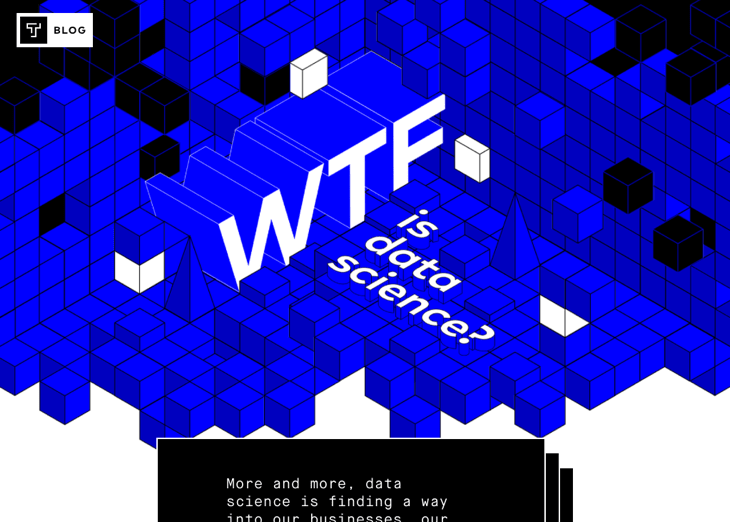
And here is another example from the Thinkful blog:
Colors
Bright colors
From what it looks like, we are in for another bright year. What’s changed is that instead of using color segments, designers now slice and dice colors even more finely, creating patchwork-like patterns and putting colors inside colors inside colors.
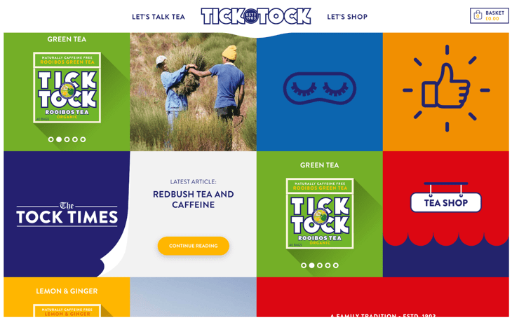
See some bright examples from the TickTock tea shop and the Algo.tv video creation platform.
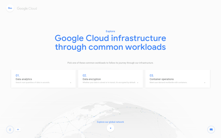
Clean backgrounds
An opposite trend is for webpage backgrounds to be light, clean-looking, and bringing just a handful of accentuated details for the forefront.
For instance, check out this toned-down, “milky” background in Google Cloud’s design.
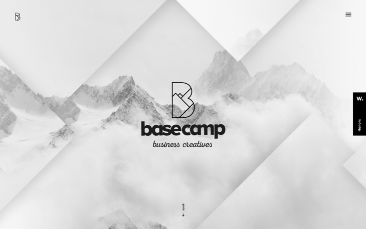
Another example is Basecamp Business Creatives Netherlands homepage. It does have some bright accents in green, but apart from that, it’s mostly gray background with some unobtrusive geometry.
In conclusion
All in all, the spectrum of modern creative designs is so diverse, it is hard to single out the main tendency. But if I were to do it, I’d say that “wavy” interfaces are what we will see a lot of next year.
If you think we’ve missed something that you have spotted, do let us know in the comments!