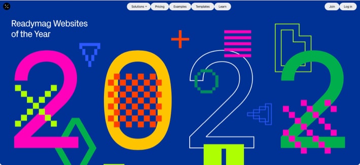
Design is the reflection of the times we live in. As 2022 is coming to a close, there is a trend for UI styles like “brutalism” (going back to bare essentials and defying sophistication) and “claymorphism” (cartoon-like aesthetic that’s meant to console and pacify) among web designers.
With this post, we are going to look at some up-and-coming design trends for 2023 that will shape the Internet’s websites the following year.
Typography
Words-as-visuals is a trend that started a few years ago and shows no sign of stopping. On modern websites, text can be big and bold; it can scream at you or whisper in your ear; it can scatter and then come back together, go in ripples, swirl, run around the page like a news ticker, or react to the touch – anything is possible in the world of today’s web typography.
Let’s look at the latest type-related trends.
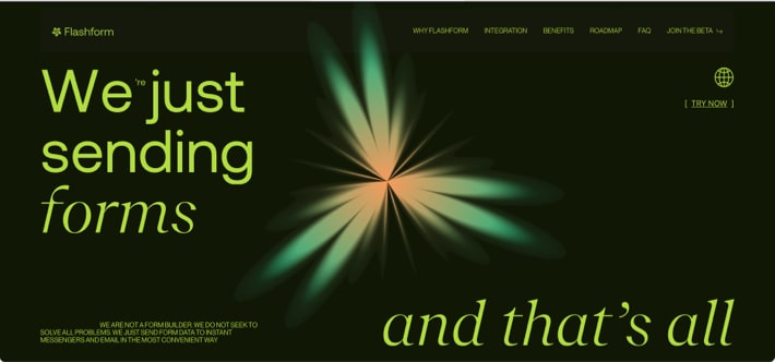
1.1 Italicized text for emphasis
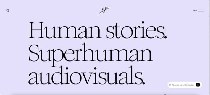
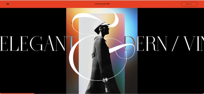
1.2 Serif fonts
If (like me) you confuse the two font types, here is a quick reminder: sans-family fonts look sleek and smooth, whereas serif-family fonts have decorative “tails” or “feet”. For years, sans fonts dominated the design space, because they look fresh and modern. But now serif fonts appear to be taking over.
1.3 Interactive and animated text
On the following website, the text in menu items changes at mouseover.
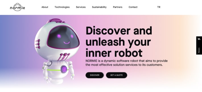
On normie.ai, the text gradually fades in as you scroll.
On the next website, the text is used to create a striking parallax effect, which adds extra dynamism to the experience.
Sectioning and layout
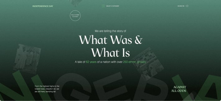
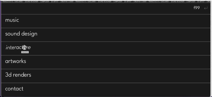
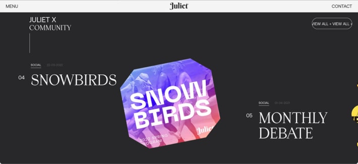
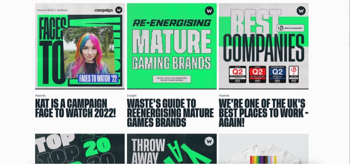
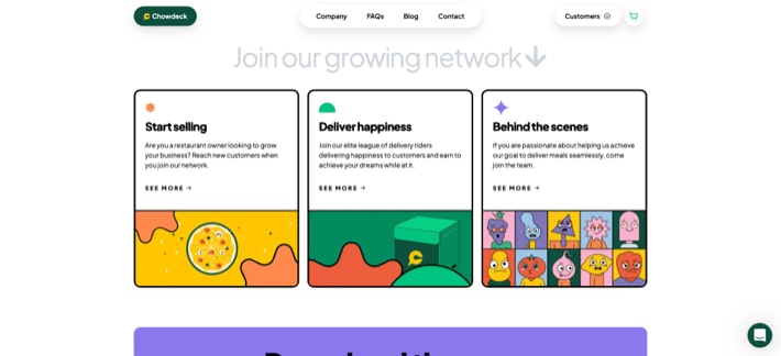
2.1 Visible borders
I don’t know if it’s a subconscious desire for stability or something, but many sites have clearly defined design elements.
On the following websites, you can see menu items and even text areas that have borders.
2.2 Smart loading
On many sites we’ve seen, elements transpire as you scroll, helping the website load faster while giving it a cleaner, uncluttered feel.
2.3 Mixing horizontal and vertical scrolling
Remember how last year we spoke about horizontal scrolling becoming more common? And now designers began mixing the two types of scrolling, which makes browsing more versatile and interesting.
Visual styles
Every year brings new go-to UI design trends, and this year is not an exception. Back in 2020, neomorphism was trending, but the trend turned out to be limited and short-lived. The main reason for that was that neomorphic designs lack contrast and impact, which is bad for both usability and perception.
This year, claymorphism is trending. Let’s see how long it lasts!
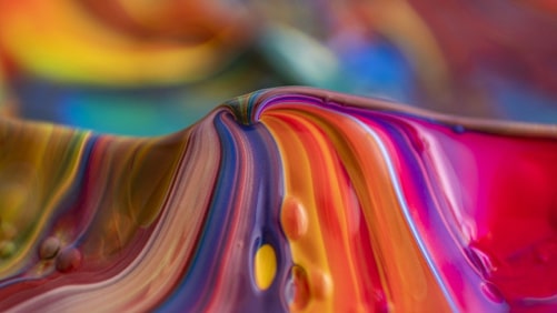
3.1 Claymorphism
Claymorphism is a hot-new UI design style, which is an offspring of neumorphism. It’s characterized by the use of bright, happy colors, rounded corners, double inner shadow and outer shadow. It has clay-like aesthetics, which looks cartoonish and, therefore, happy.
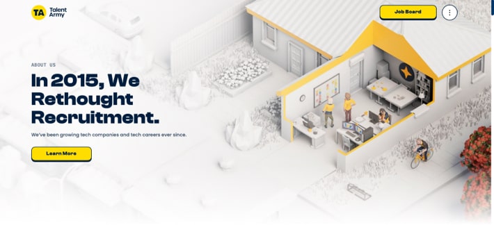
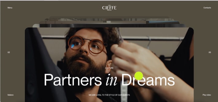
3.2 Brutalism
Web pages that abide by the laws of brutalism look plain and bold at the same time. On the one hand, they appear stripped down to bare essentials. On the other hand, they attack you with a handful of “loud” elements that stand in sharp contrast to an otherwise lifeless/underwhelming page.
Brutalism (aka neo-brutalism) is characterized by:
- Loud, contrasting strokes
- Stark shadows
- Eye-popping colors
- Aggressive graphics
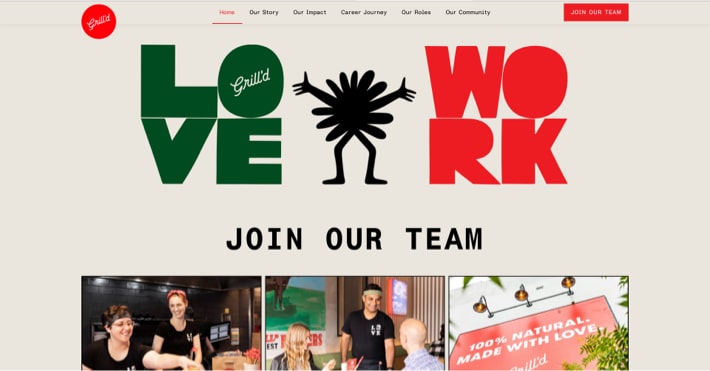
Brutalism, therefore, is a way to design user interfaces with a strong impression of pure functionality and strong behaviors over regular form.
Figma, a well-known provider of web design tools, is a big advocate of (neo)brutalism, which you can tell by looking at their website.
3.3 Material You / Material Design 3
First unveiled in mid-2021, Material You (aka Material Design 3) is a style developed by Google and touted as “the next stage for Material Design.”
MD 3 employs dynamic color to enable personalization, provides a set of icon fonts created at seven weights, and suggests a rounded-by-default shape family, among other recommendations.
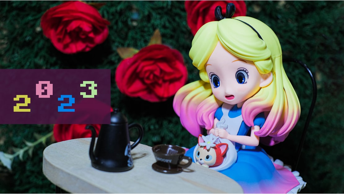
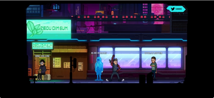
3.4 Retro styles
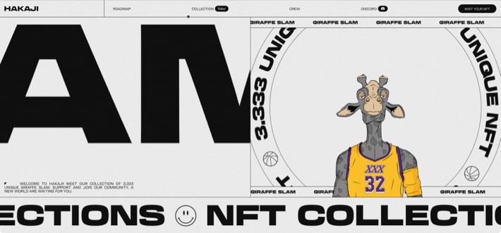
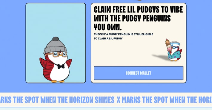
Perhaps in a nod to the recent obsession with NFTs (that are generally forgiving to sloppy design), some websites reverse-evolve to 2000’s aesthetics with pixelated graphics and intentionally outdated looks.
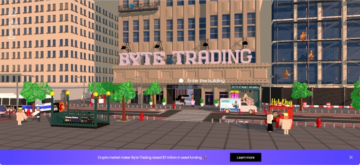
3.5 Proliferation of motion design
Last but not least, animated graphics seem to be king these days. It is used almost everywhere, on the majority of websites we have analyzed.
People are getting more and more accustomed to consuming information through animated images, so motion design has become ubiquitous. It’s increasingly harder now to sustain the viewer’s attention, in part because people are used to the format of TikTok clips, Instagram reels, and YouTube shorts that are video-based and feed the user information in small bites. By animating a static image even a tiny bit, you help the visitor to linger there a little longer, which is good for marketing.
TL; DR
As of the end of 2022, typography is still very important. Also, several distinct trends this year are claymorphism, brutalism, the use of distinct borders in webpage elements, the use of italicized text, among others. Motion design proliferates in our attention-deficient world, as well.
Have we missed anything? Please let us know in the comments.
Related Blogs
Web Design Trends 2022: Bring in the Colors
LEARN MORE