Big thanks to Evgeny Rugalev for helping me write this post 😉
A few years ago we wrote our predictions for 2019 and said that, thanks to modern browsers supporting really sophisticated CSS these days, web designers went all out with head-spinning animation and bold micro actions. Back then, many websites went a little over the top with that.
Now that 2021 is fast approaching, these sophisticated designs have matured into something calmer, classier and more functional. Let’s see what 2021 has in store in terms of web design.
1. Neomorphism
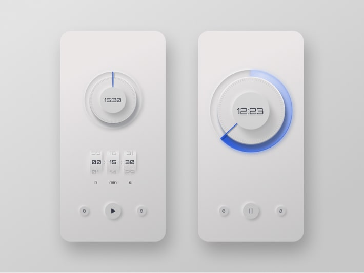
The general trend this year is realistic-looking visuals. Neomorphism (sometimes called Neumorphism) is the revival of true-to-live design elements that went out of style when flat design replaced skeuomorphism and was itself replaced by material design around 2015.
But there is a twist to neomorphism (otherwise, why would it have the “neo/neu” prefix?) Neomorphic touch elements are made from the same “stuff” as the backdrop they are used against. They appear to have been pushed out of the background, which gives them volume.
It’s hard to tell if neomorphic shapes are being used much outside of touchscreen interfaces. Some people say neomorphism could only work “when paired with haptic feedback”, that is, when the user gets tactile feedback from interacting with the interface. Otherwise, such controls could lack contrast and visibility that are essential for good UX.
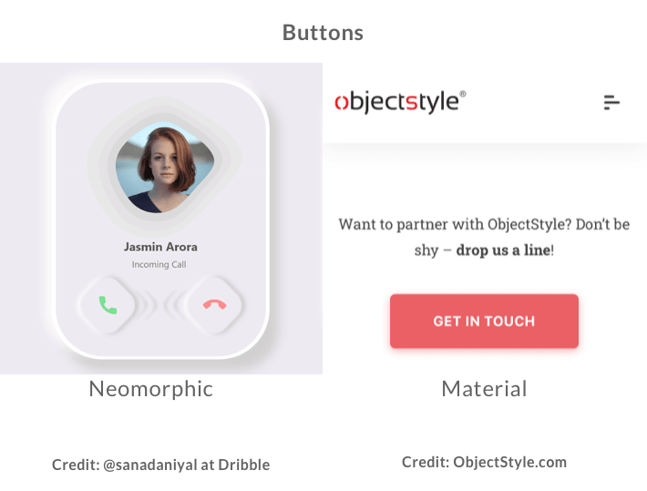
So what’s the difference between neomorphism vs material design? We have prepared an example for you with a material (right) and a neomorphic (left) button. Notice how the material-design button looks like a separate object placed on top of the background, while the neomorphic button seems to protrude from the menu:
2. Glassmorphism
Glassmorphism is also about adding depth and realism to your design. Unlike neomorphism, it makes use of multiple layers, whereas the superimposed object is somewhat see-through and has the frosted glass effect.
The trend is very distinct and instantly recognizable. Our prediction is that its popularity may be short-lived if it gets overused by too many designers too quickly.
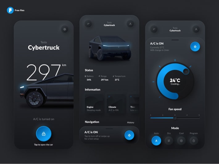
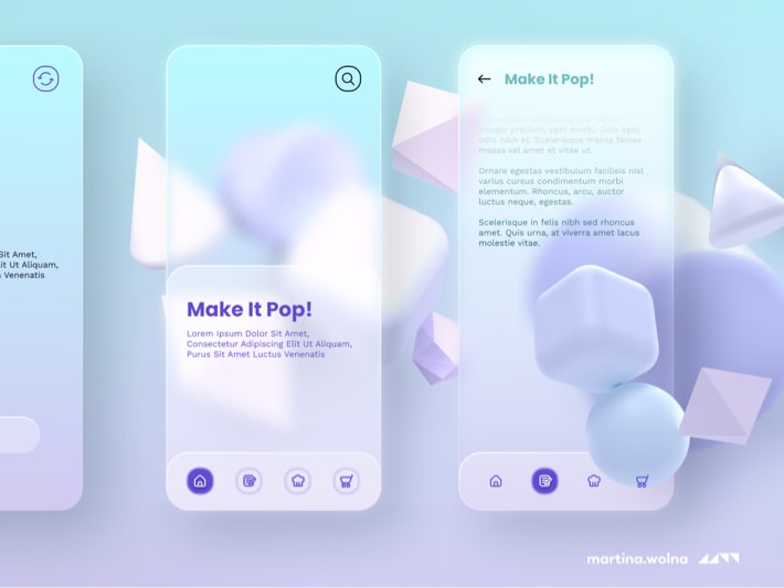
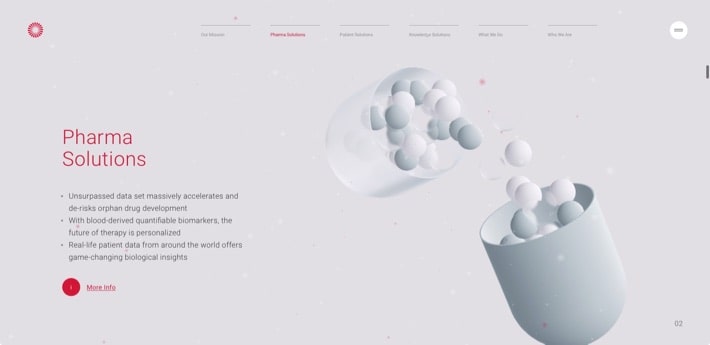
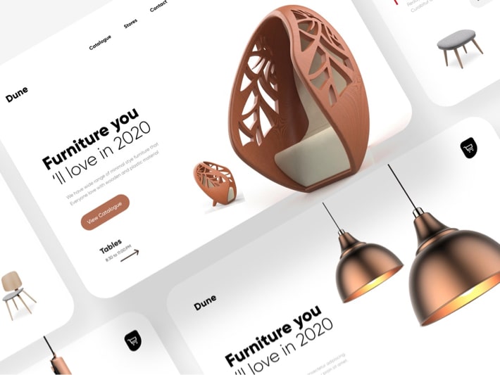
3. Three-dimensional (3D) imagery
In their pursuit of realism, designers have been turning to realistic-looking 3D shapes this year more than ever. 3D has the benefits of both illustration and animation, which can give one’s design a fresh and unique look.
4. Composite parallax
There is a lot of action going on on websites these days. Designers have been resorting to animation and deeper parallax towards the end of 2020.
The parallax effect has undergone a qualitative change this year. We’ve seen it being used in new ways, with several layers of design elements enveloping the focal point, thus giving the focal element additional depth.
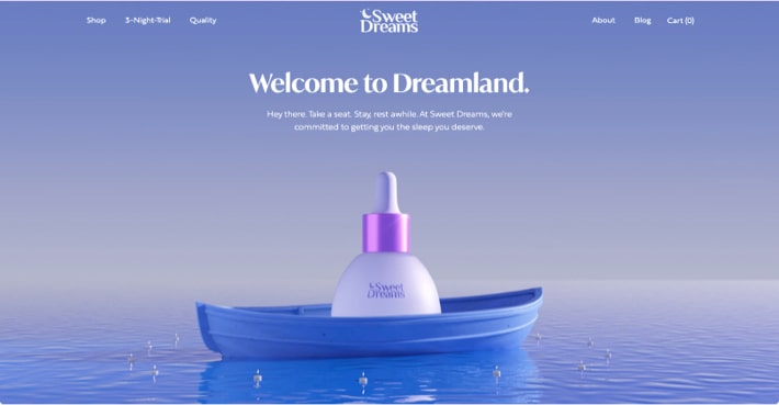
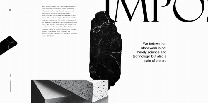
5. Organic design
If the above-mentioned realism-rooted trends haven’t been enough, here is another one for you – organic design and organic shapes.
The organic design trend is all about using natural, tactile elements that evoke the feeling of being immersed in nature. Designers make ample use of neutral colors, organic shapes, botanical design, and natural textures.
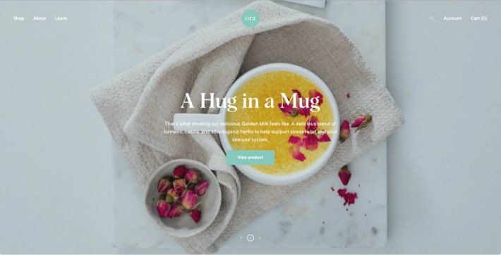
Organic shapes are the opposite of strict geometric figures like straight lines or rectangles – they are curved, irregular shapes that one would expect to see in nature.
6. Emphasis on usability and accessibility
Like we said at the start of this article, technical intricacy is giving way to practicality this year. Complex designs should not only be visually-compelling, but also useful to the user.
After all, people come to websites not just to marvel at gorgeous design, but to do practical things like making a purchase or finding some information. So design is also about improving inclusivity and accessibility through ensuring strong color contrast between text and background, writing straightforward copy, and making buttons easy to spot.
By the way, speaking of easy-to-spot buttons, I like it how some designers literally have “stickers” that tell you what those buttons do:
7. Brass color
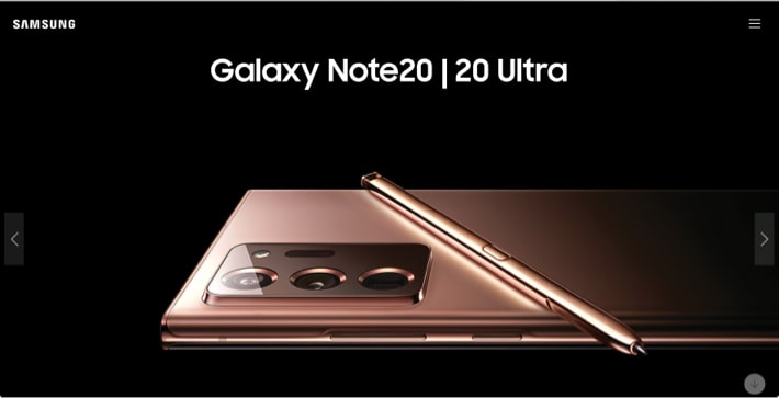
As I got to this trend, I just knew that if I went to Samsung Galaxy’s website now, they would have at least some phones in this color – and they didn’t disappoint.
The brass color is likely the color of the year. And its use is not limited to web design – it’s on gadgets, cosmetics packages, and other items. I even own a professional hair brush that’s glossy brass.
Variations include dusty rose, glossy teal and silvery colors.
In conclusion
Evgeny and I have been predicting web design trends since 2018. One thing we learned in those years is that people who chase the latest trends sometimes mess up crucial design elements that provide a foundation for good old “boring” user experience.
We are talking about UI fundamentals like:
- visual hierarchy
- color & contrast
- alignment (proximity)
- scale
- typography
- white space
So even if you are willing to try out some new shiny tactic, remember about the basics that, when ignored, could make your attempt to impress futile.
We are happy to see that the community seems to be headed in a direction that is more functional and less chaotic. Hopefully, this is how web design will be this coming year.
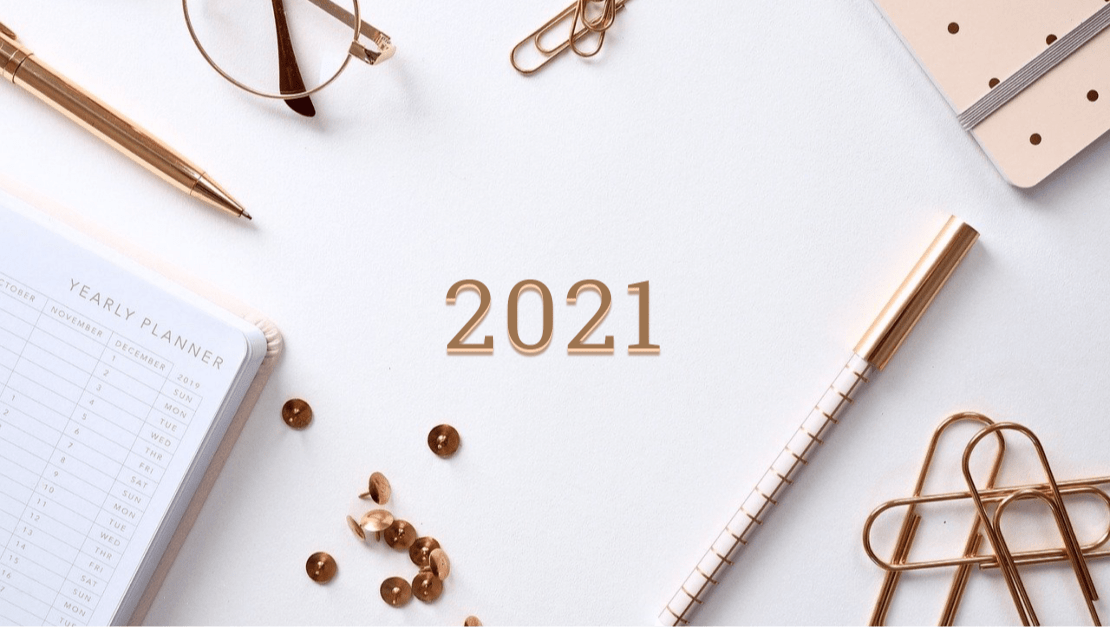
Thank you for reading and Happy 2021!
Related Blogs
UX Cafe: Using Customer Journey Maps to Improve User Experience
LEARN MORE