Many thanks to Evgeny Rugalev for helping me put together this list 😉
Below, we summarize some web design trends that are likely to define 2018. The general tendencies we foresee are mobile-inspired design, realistic look and feel of web pages, and heavy use of geometry, asymmetry, and bright colors. We hope you enjoy it!
1. Nearly-tangible design
The trend that has already started in 2017 is for design elements to have the look and feel of real-world things. Think old typewriter-style text, fonts that sport traces of wet ink, and websites that give you a sense of magnetic gravity as you scroll.
2. Watercolor background
The surprising newcomer this year is the watercolor-esque background, which is probably something that builds on the currently-popular true-to-life trend. Still, I believe it can be singled out as a distinct novelty approach.
3. Three-dimensional text
Do you remember the good old drop shadow text that used to be popular some 10 to 15 years ago? Ever since, it’s been ousted out by flat-design typography, but, this year, it looks like 3D text is making a comeback – looking very different this time.
Please note the absence of the old-style drop shadow and the presence of a complex, color-based gradient, which makes the text look like an actual neon sign on someone’s brick-and-mortar store.
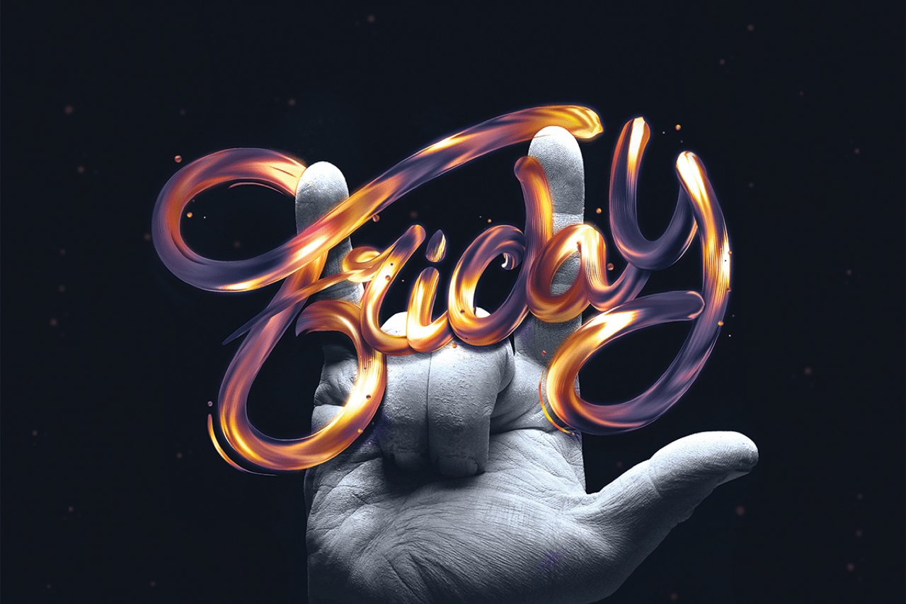
4. Creative typography
A major design trend we’re going to see in 2018 is creative typography. Creative typography is nothing new – it’s been around for a few years now. But we expect much crazier implementations – such as dripping text, glossy and lit-up text, etc. – in the coming year.
In particular, we expect heavy use of such fonts in logo design. It can give your brand character and turn your text logo into a unique illustration due to additional embellishments (curved lines, geometrical figures, etc.).
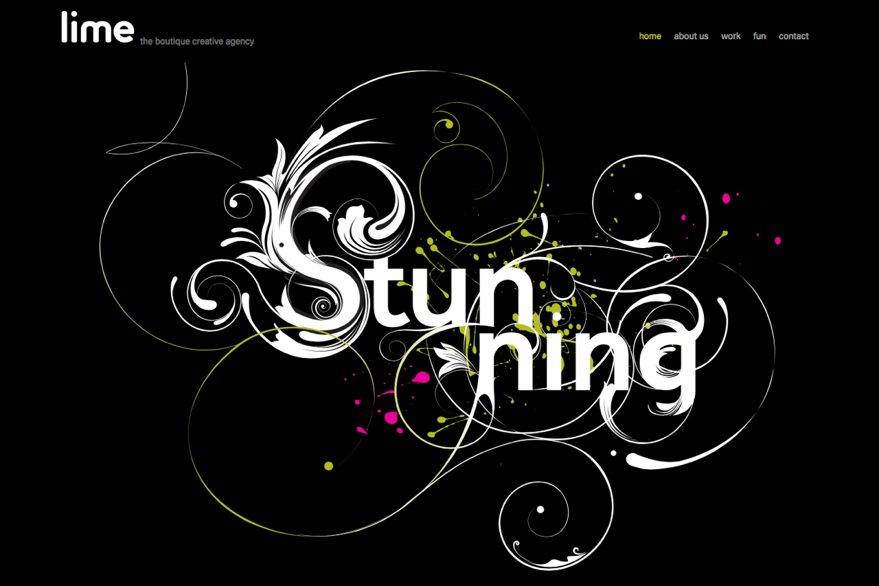
5. Typography cutouts
Great designers of the past had given see-through text a shot. But it used to make websites slow and was difficult to implement.
Come 2017: using present-day coding practices (a combination of HTML, CSS, and JavaScript), you can do “cutout text” pretty easily, and your design won’t bog down site speed or performance. Hence, the trend is back, and it consists in designers making the text see-through and placing an image behind it.
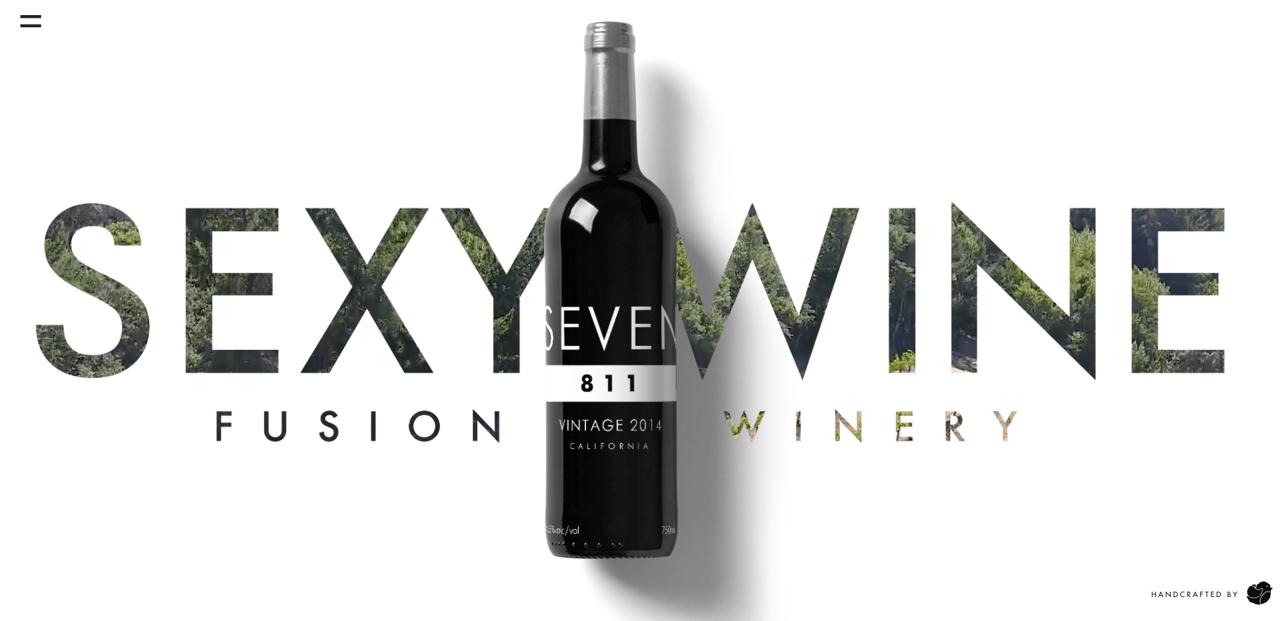
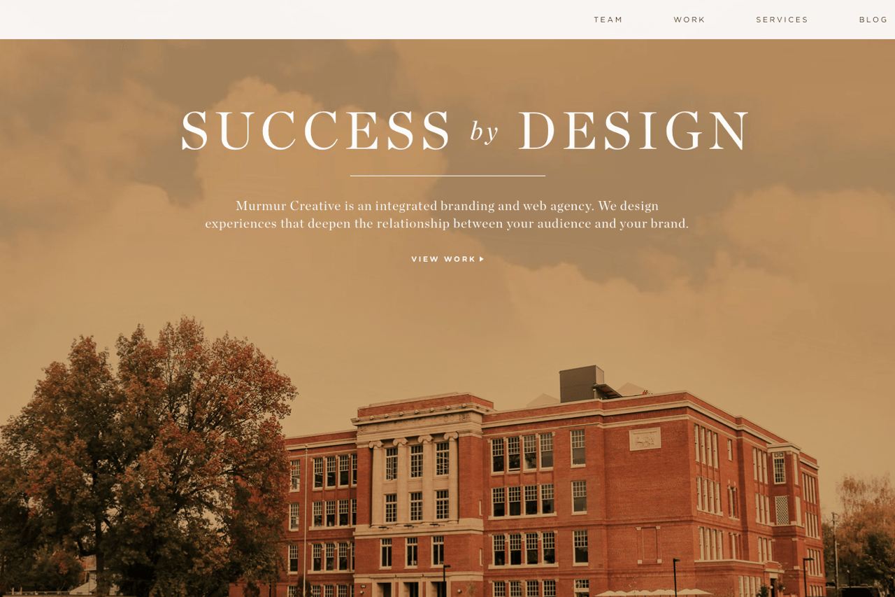
6. Oversized headings
As a bow to mobile-first design, another shift is towards using huge headings followed by normal-sized text.
Branching out from this trend are two diametrically opposed tendencies: headings are either tall, thin, and elegant or they are bold and massive – whatever works to contrast them with the rest of the text.
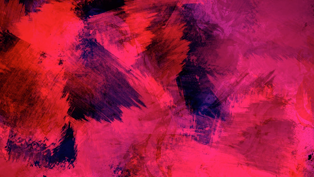
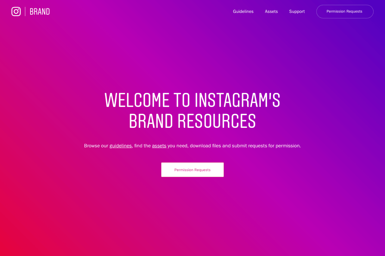
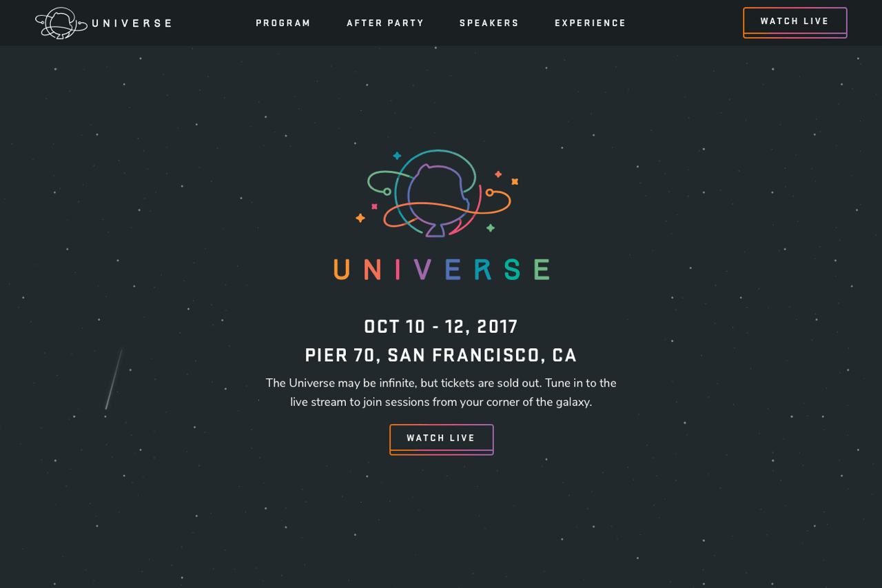
7. Rich psychedelic colors
Instagram is to blame for this trend. The moment the social media giant changed their logo, many other famous brands started to turn up brightness on their designs (such as YouTube making their logo “pure red” or MasterCard redesigning its media kit to include plain, bright colors).
Hence, it looks like 2018 will be a bright year in all respects. We will see many websites “wearing” rich, colorful designs. The color palette reminds one of the typical psychedelic selection of pinks, purples, oranges, yellows, and blues.
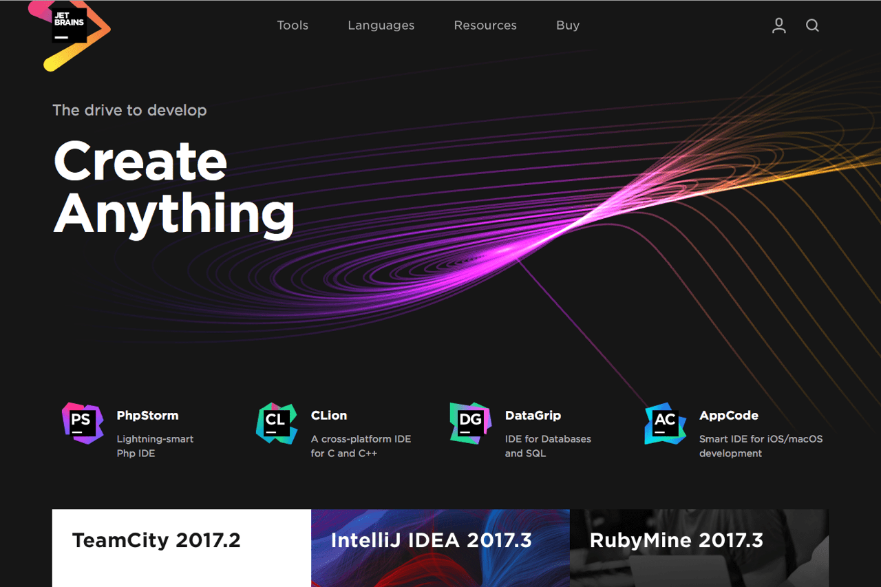
8. Complex gradient
In 2018, we’re going to see gradients of all shapes and sizes: so not just the linear gradient, but also the radial and reverse gradients. By this time, everyone has gotten slightly weary of flat forms everywhere (definitely a consequence of flat design proliferating). So, the mission for the upcoming year will be to add some volume to different design elements. And that’s what the gradient does.
9. Spaced-out layout
As a Walt Whitman fan, I’m forever entranced by his “measureless oceans of space” metaphor. And now it seems like the concept has made its way into web design.
In 2018, we’ll see white space (aka “negative space”) used to push apart page elements that should be distinct. The tendency we’ve observed has been text boxes that take up about one-third of the page’s width – or even less.
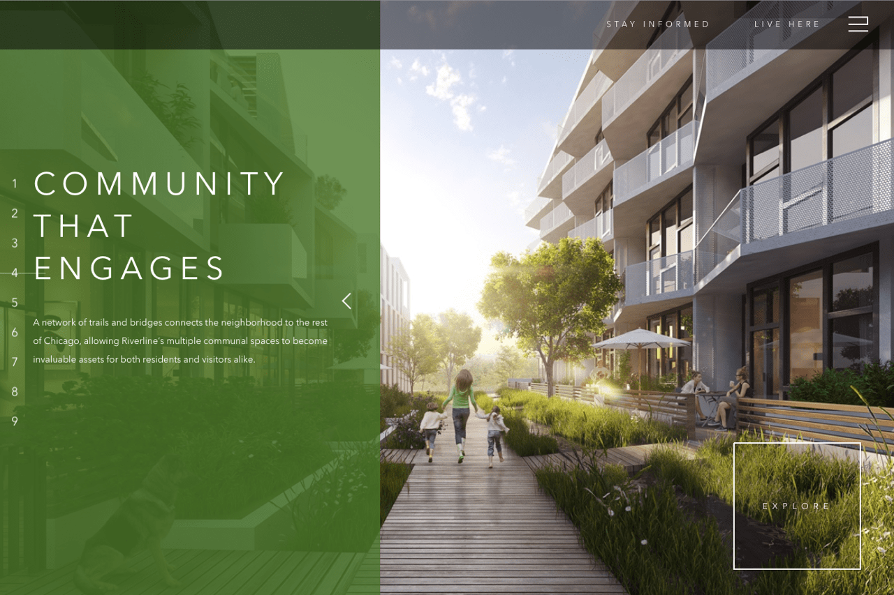
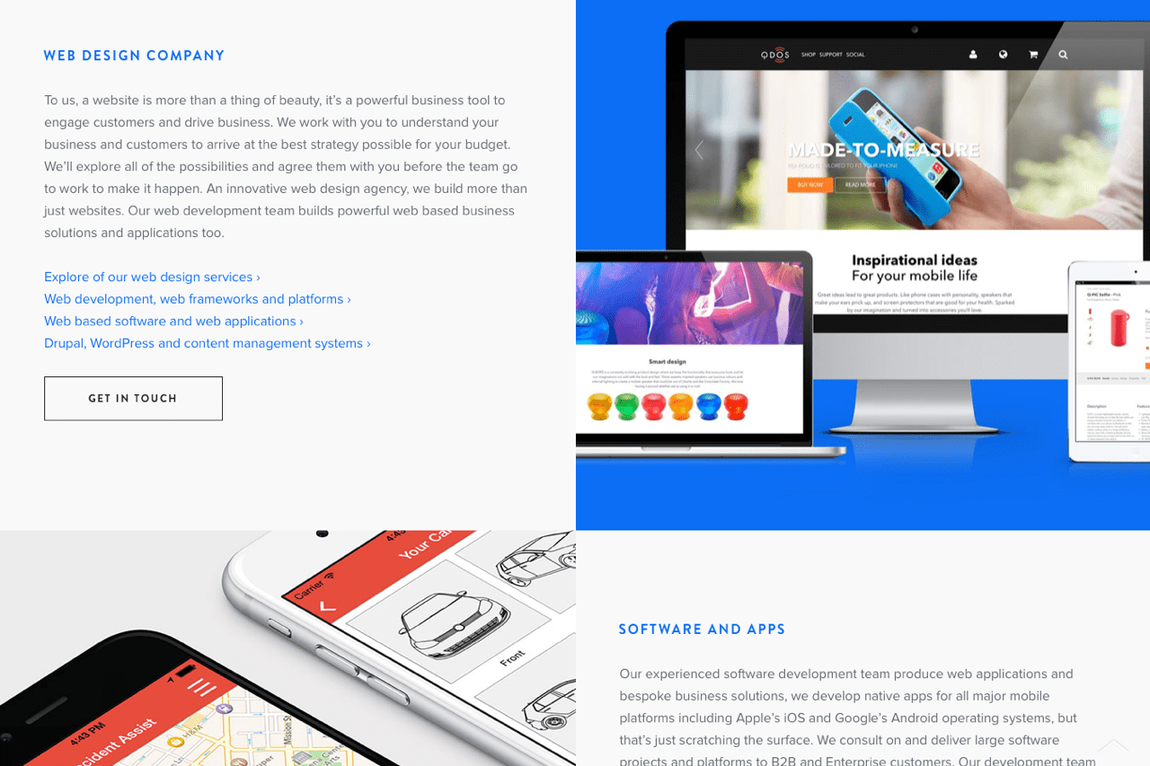
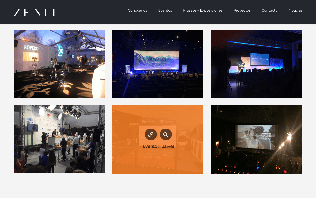
10. Half screens / cards
Yet another tendency is to break the page into two or more vertical segments. One of these “cards” may contain text, while the other one may have imagery. Such segmentation is definitely inspired by mobile, since smaller information chunks are easier to adapt to smaller screens.
11. Asymmetric layout
Brought about by the new options that appeared in CSS in 2017, the asymmetric revolution is taking place in web design as we speak. Elements on the page are carefully made to look scattered and randomly placed – which is totally by design. So, next time you think there’s something wrong with that text sticking out from the square frame, think again, since that may be how the artist envisioned it.
12. One context, many meanings
As designers strive to make better use of the page’s real estate, layouts that incorporate multiple variables within one context become handy. This is a great alternative to long, descriptive writings. Another benefit is that you can grab site visitors’ attention with one element and leverage it to show additional elements that occur in the same context.
13. Unobtrusive buttons
Buttons that resemble anything but traditional C2A buttons will have their place in next-year’s design trends. To avoid the typical color-filled option, you can mark buttons using thin borders, underlining, scroll-triggered animation, and other tricks that call visitors’ attention to critical parts of your site.
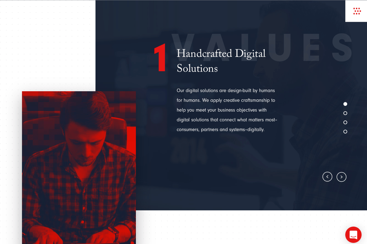
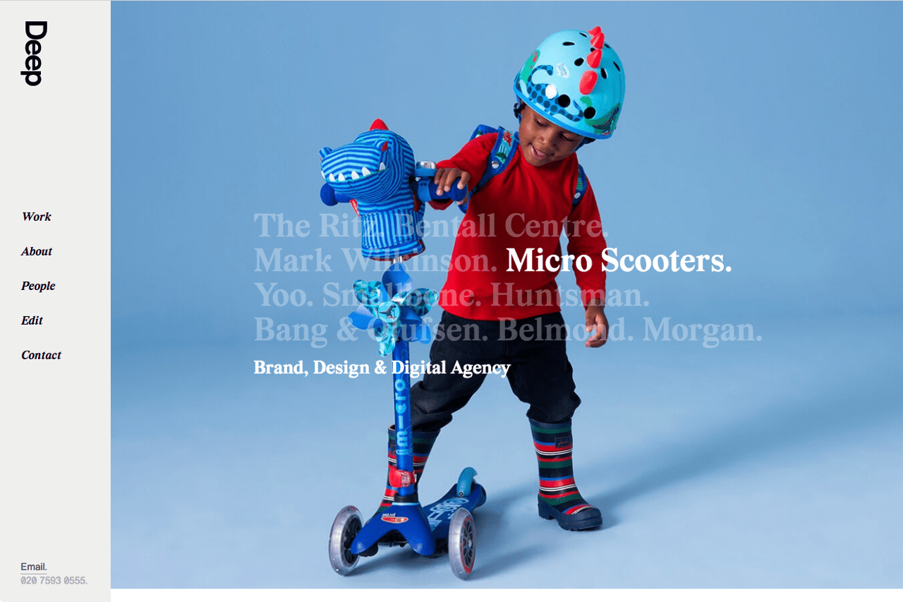
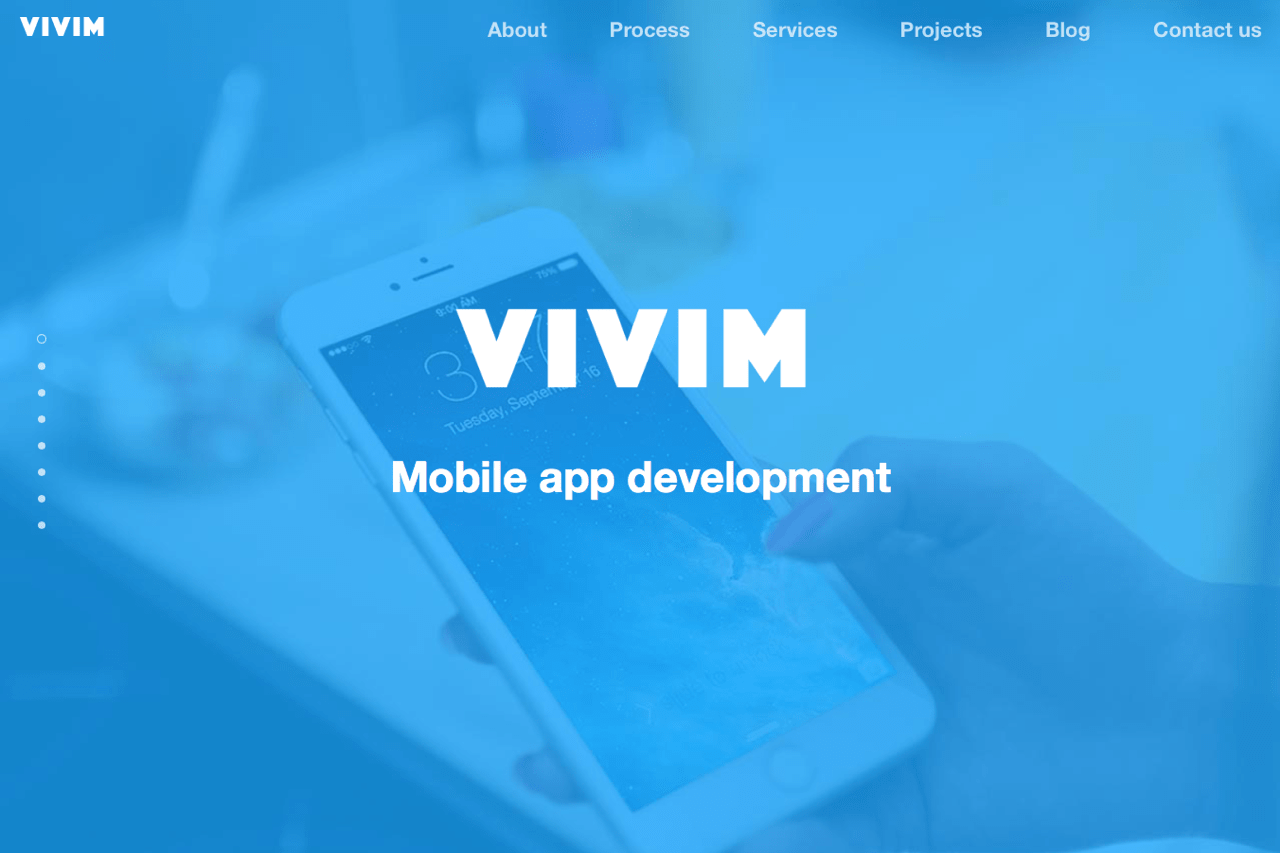
14. Visuals as backgrounds
While this is barely new, the trend is to superimpose additional information such as headings, calls-to-action, text, and tags on images. Not only does this help unclutter your page, but also gives your design a more modern, techy feel.
15. Nothing but text above the fold
The key to making the most of this design trend is to refine your message. Your wording has to nail it and cut right to the core of the message you’re trying to deliver.
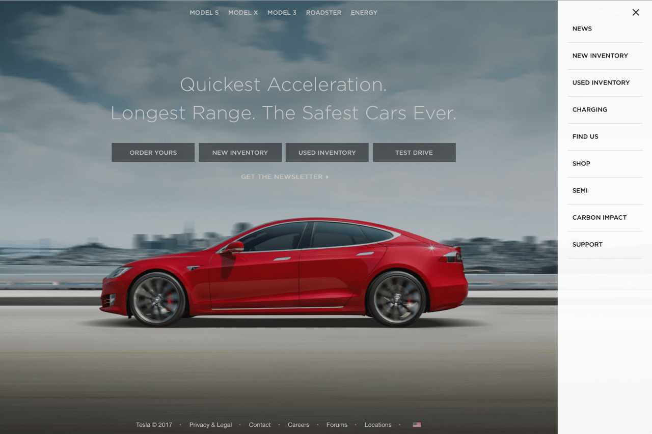
16. Hidden/side menus
Certainly coming from mobile is a trend to hide menus by default, either under the hamburger-like button or by another button that looks like a clickable piece. We’ve been also seeing an increasing number of side menus and ruler-type menus that use a grid to show where you are on the page.
17. Graphics/geometry over photography
There will likely be a decline in the amount of photographs used and an increase in illustration, exclusive graphics, typography-as-design elements, and similar things.
Blurred images and stock-looking images will remain a no-no, and the trend to include original, authentic imagery will increase.
18. Animated geometry
As web programming languages (such as CSS3) become more capable of pulling off complex animation, more people are starting to make use of it. One of the latest trends is to mesmerize and attract user’s attention with animated geometric figures.
In Conclusion
To sum up what’s been said, some of the buzzwords for web design in 2018 could be “realism,” “volume,” “depth,” “brightness,” “geometry,” “asymmetry,” “compactness,” “originality,” and “mobile.”
Now that we have discussed the major trends for 2018, the question that remains is – which of these trends do you think will be the most popular? Are there any web design trends for 2018 that we missed? Please share your thoughts in the comments!