Updated on December 13th, 2024
We have a custom at ObjectStyle. Each December, we look at the web design trends that took foothold in the soon-to-be-gone year, and make predictions for the next one.
More often than not, certain tendencies go on for several years, having a multi-annum life cycle. And some trends simply die out, or make a comeback for no particular reason. So we normally look at how things have changed in the past twelve months.
With that said, let’s dive in—here’s a list of the latest web design trends and predictions for 2025.
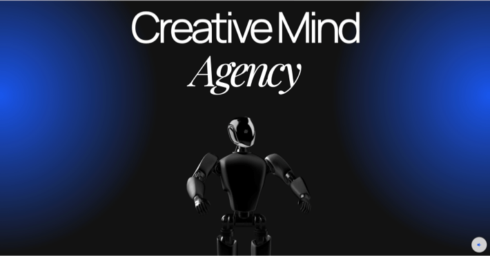
1. Anti-Design
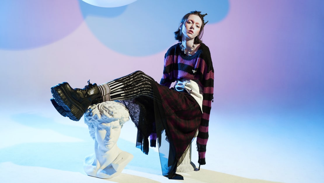
Anti-design is an approach that throws design norms out of the window. From Jaguar’s “Copy Nothing” campaign to websites that look like they were built by a five-year-old, the tendency to break the rules in a freestyle fashion has reached its peak at the end of this year. Some say the trend has its roots in the punk rock culture and grunge aesthetic. Whether it’s true or not, this visual style does have the same rebellious spirit that seems to defy prettiness.
In the following example from VisualMatter, the site uses super-vibrant colors, and the layout doesn’t appear to follow any rules.
One thing you notice about websites that follow this pattern is they are all different. By breaking the mold designers are able to craft pages that ooze a sense of creative freedom, which definitely makes the brand memorable.
A similar trend, brutalism, has been all the rage since 2023. Many consider brutalism a type of anti-design, since it largely fits the bill with its no-background backgrounds, disproportionately large elements, and other design norm violations.
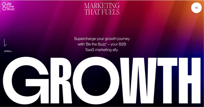
2. Animated Gradient Backgrounds
The tendency to use color gradients in titles and backgrounds is still going strong. The only twist is we are now seeing more animated color gradients, than static ones. The creative use of color allows designers to add depth and versatility to webpages without resorting illustrations or photo images.
Two-color gradients are still everybody’s darlings, with single-color and multi-color (three or more colors) variations being slightly more rare.
3. Spline-Based 3D Animations
The design community is somewhat torn on this one. Some believe that fewer people will be using tools like Spline next year to create 3D animation for two reasons: (1) they are too recognizable and therefore their popularity is declining, (2) bulky animations negatively impact webpage speed, and most commercial sites would rather not use them.
At the same time, Spline themselves offer different tactics for optimizing scenes to make them faster and more efficient. I, for one, believe that, when used smartly and creatively, 3D animations can make a website stand out without much effort and give it an elaborate look. For example, check out the following website:
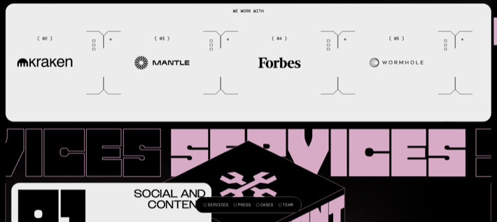
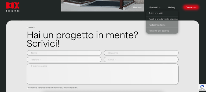
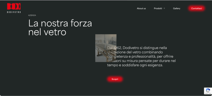
4. Line Borders and Breaks
In a nod to old-school design where most interface elements had borders, the outlines are back after a long break. They made a comeback a few years ago, and are still very much a trend. We’ve been observing many websites use lines in a frame-like manner as well as outlines around design elements like buttons, images, form fields, etc.
In the following example from Dodivetro, lines are used to separate menu items. Also, form fields have line borders instead of something else.
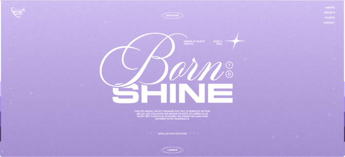
On BornToShine’s website, we can see thin white lines defining parts of a photo card:
5. Video Reels
The number of websites that use video clips has grown significantly in the past few years. Bright, vibrant video sequences are usually used on the first hero screen, but may be placed elsewhere on the website.
With that said, instead of using normal-speed clips, designers often create sequences of short, fast-paced multimedia (a trend started by TikTok), which may overwhelm some users, but is great for grabbing Zoomers’ attention.
And sometimes, instead of using videos, designers create fast-paced slideshows from static images that look like video reels. The user would find it nearly impossible to take a good look at each individual image, but these “moving pictures” give energy to the website and again appeal to younger audiences.
6. Retro Style
Just like last year, quite a few websites are still leaning into the retro aesthetic. From pixelated shapes to thick, stark shadows, to old-school fonts there is plenty of ideas from past decades designers can draw on.
At the same time, these websites usually combine retro-inspired design with modern techniques, which is why they work.
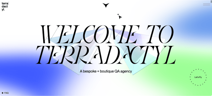
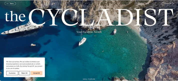
7. Fewer Super-Sized Page Titles
Last year, we saw many examples of one-liners that occupied the entire page’s height. This year, we are seeing fewer of them. Page titles are still big, but they got slightly smaller. Designers went from having titles occupy the entire vertical space to titles that occupy ½ or ⅓ of the page’s height or less.
8. Humanist Sans Serif Fonts
“Humanist” fonts are typefaces that resemble handwritten text. The human touch is achieved by alternating line thickness with a character, the way it naturally happens in calligraphy. Some humanist typefaces are serif fonts, while others don’t have serifs. Humanist sans typefaces have a lot in common with serif fonts, and those not closely familiar with typography can mix them up.
Humanist sans serifs appear visually sharp and chiseled. You get the best of both worlds: the readability of serif fonts and the minimalism of sans typefaces.
On another note, new types of serif fonts have been on the rise, too. They manage to achieve the sleekness of their sans serif counterparts, which gives them a fresh, modern look-and-feel.
9. Out-of-Focus Elements
While this is a bold move and may not be for everyone, some websites contain intentionally blurry elements like buttons or photos. All in all, this trick has been frequently used in print advertising in the past year or so, but there are also web designers who are jumping on the bandwagon.
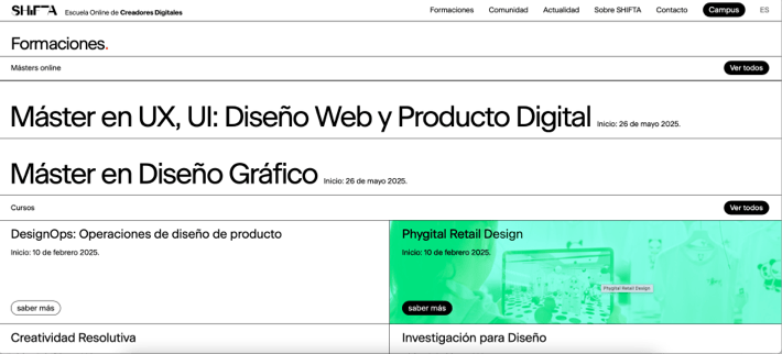
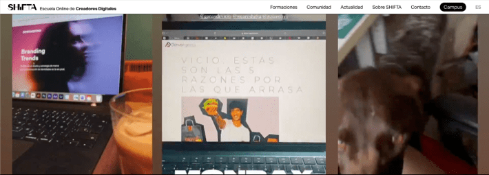
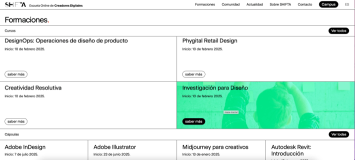
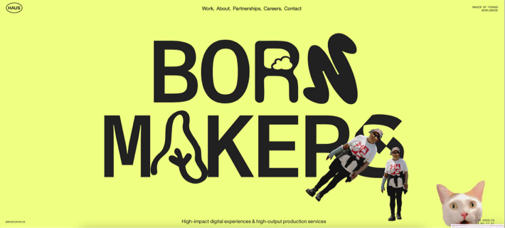
10. Images Hidden in Background
There is now a new tendency to hide images, “Easter-egg”-fashion, behind page elements, only for them to be accidentally discovered by the user as they interact with the page. It’s similar to how home interior designers sometimes hide extra furniture in walls—at a first glance, the space looks clean and minimalist, but there is more going on behind the scenes.
Try going through the section under “Formaciones” on WeAreShifta’s website:
And now move the cursor around the first screen on the Haus website.
In Conclusion
As a rule, design trends do not follow the human calendar. Some trends appear quietly mid-year and gain traction over the course of several years. Others start with a bang and become popular very quickly, but—just like meteors—they fade into irrelevance just as quickly.
Therefore, there is no clear timeline for the above-mentioned design approaches, but we believe we will be seeing a lot of them in the coming year 2025.
Post image credit: NinaWind on Pixapay
Related Blogs

UX Cafe: Using Customer Journey Maps to Improve User Experience
LEARN MORE